REVIEW: “Liberator” #1

(Black Mask Studios, 2013)

Review by Brad Gischia

Creator/Writer – Matt Miner
Art – Javier Sanchez Aranda
Colors – Joaquin Pereyra
Letters/Edits – Vito Delsante

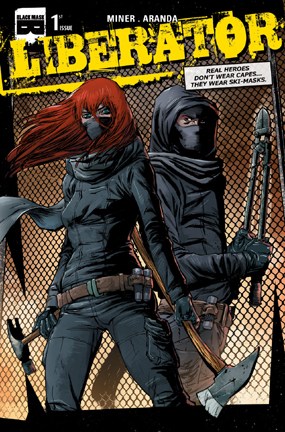
Liberator-iss1-cover1a-small1*Caution, moderate spoilers

Greetings from the Wasteland,

Does another Wednesday loom already?  Are you looking for something new to pick up on NCBD?  Look no further.  Liberator #1, “Rage Ignition”, will be on the stands.

The first of a four-part series focuses on Damon, a disinterested barista, who spends his off time in the endless battle against animal cruelty, specifically the rescue of fighter dogs.

Damon uses a specific breed of non-violent vigilantism in precision strikes against those who would and do harm animals.  He is completely off the radar and behind the scenes, sticking to night strikes and keeping a low profile.  There are clues in the story that hint at a troubled past which drives him onward.

Jeanette is a political activist, fighting the same battle in a public arena, a media flash-bang who isn’t afraid to chain herself to an ancient oak tree or splatter red paint on a rich woman’s mink.  The friendship is budding in the first story, but as the cover advertises, it looks to become a partnership.

The book manages to be entertaining while informative and takes a serious look at a subject that seems to have fallen out of the public eye as of late.  Miner’s narrative is well thought out and precise, paired nicely with Aranda’s artwork, which captures the horror of fur farms and thrusts it onto the page and into your eyeballs weather you want it to or not.

I would be remiss if I did not mention that behind this book, behind a good story about people trying to help animals, is a hero himself.  Matt Miner has spent years doing animal rescue, a fact evidenced by his three dogs and three cats, all rescues, and the people and organizations that backed him for the Liberator project.  Mr. Miner’s passion for the subject cannot be denied.  F. Fang interviewed him for Bag and Bored in December of 2012, to promote the Liberator Kickstarter. Obviously it was a success, with such backers as the bands Bad Religion and the Descendants, as well as numerous animal rights backers such as DARTT (Defending Animal Rights Today and Tomorrow) and NAALPO (North American Animal Liberation Press Office).  There were also numerous independent backers, all of whom are listed at the back of the book.

Extra articles appear at the end of the book.  The first spotlights the Animal Liberation movement by Nicoal Sheen and Greg Kelly.  The second, by Toni Phillips, warns against the dangers of BSL, or Breed Specific Legislation, which targets certain dogs for extermination based solely on the breed.  Both are informative and compelling.

I think it is all best summed up by Damon in the final panel, “…sometimes evil is doing nothing in the face of atrocity.”  It is a quote that means a little more when placed so near in important issue.  So do something to help.  Go to your local comic shop and pick up Liberators #1.  Not only will you be picking up a good comic, but you’ll be helping a good cause as well.

*To see the original F. Fang interview go to http://bagandbored.net/category/liberator/

*Copies of Liberator #1 are available in comic shops and online at Blackmaskstudios.com

___________________________

Follow Brad Gischia on Twitter:  @comicwasteland

REVIEW: “Superman Unchained” #1

(DC Comics, 2013)

Review by Shawn Warner

WRITTEN BY:  Scott Snyder
PENCILS BY:  Jim Lee & Dustin Nguyen
INKS BY:  Dustin Nguyen & Scott Williams

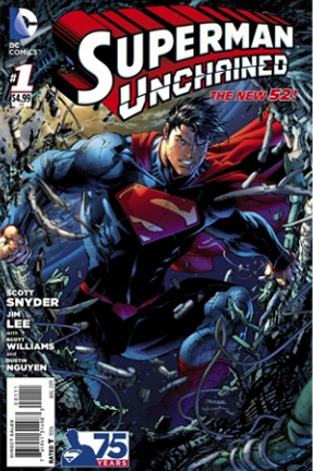
SupermanUnchained-issue1-coverThe sky is falling, well not really but the satellites in it sure seem to be falling out of it at an alarming rate. So who else could save the day from such perilous events but Big Blue himself, Superman? Not just any Superman but Superman as brought to us by Batman scribe extraordinaire Scott Snyder and legendary artist Jim Lee, so to say that expectations are high would be beyond an understatement. In fact these kinds of big titles with big names attached to them can sometimes falter under the weight of such high expectations however, I am happy to report that is not the case here. Superman Unchained comes out of the gate with guns blazing. There is no lengthy build up, it is action just about from page one and there a very few more qualified to bring that action to life than Jim Lee. He is at the top of his game here, time has not diminished his vast arsenal of skills, and quite to the contrary he seems to have gotten better in the interval between his stint on Justice League at the launch of the New 52 and now. Though we have seen his work on Superman many times in the past this is a more multi-faceted Man of Steel, much more than a new uniform this Superman is beefed up and intimidating when necessary without losing the benevolent warmth betrayed by his boyish facial features. Lee nails the balance between savior of the world and Boy Scout this comes with the intimacy with which he knows this character.

The story centers on an as yet unknown villain or terrorist group responsible for hurling satellites at the Earth from space. The opening pages, including a fold-out poster are lavishly rendered scenes of Superman rescuing a team of astronauts from being victims of one such attack. The hyper-detailed wreckage and anguished facial features of the characters are visually stunning. It is impossible to heap enough accolades upon Lee’s work on this book, to say it is incredible would be vastly insufficient and would very quickly become redundant suffice to say there is not a panel in this book that is not a treat to scrutinize with the same eye a jeweler would use to gaze upon a flawless diamond. It is that good.

Scott Snyder does an equally excellent job of writing this Superman of the New 52. In fact he seems to have very intentionally modified this Superman to be an integral part of the New 52. He appears to feel at home in this universe where other super-heroes exist and he is friends with and even a member of a team of these heroes. Perhaps even more so than Superman, Clark seems to fit right into this world where he no longer works at the Daily Planet but maintains very close ties with Jimmy (now Jim) Olsen and Lois Lane. Clark and Jim share bagels while he and Lois discuss Superman’s response to the rash of plummeting satellites. Snyder writes dialogue that is deeply human and rings true; each character’s voice is unique and recognizable, which is in my opinion the mark of good dialogue. The rhythm, the back and forth between characters is impeccable and gives his dialogue that much more credibility. Clark learns from Lois that one of the satellites that was missed by Superman and crashed harmlessly into the sea was reported to have been stopped by him. This prompts a further investigation in which Superman finds a hand print on the satellite wreckage right before he is accidentally fired upon by a submarine carrying General Lane, Lois’ father. It seems they were destroying the remains of this satellite for reasons that make much more sense when you see the final page reveal.

Snyder masterfully builds up to the reveal, he mentions possible perpetrators; Ascension, the terrorist group and of course Lex Luthor is not beyond suspicion. In one of the books most exciting scenes Superman questions Lex in a helicopter over Metropolis. He turns the chopper upside down but never manages to rile Luthor who sits calmly reading the Iliad. The interaction with Lex is just one of the many classic elements that are meticulously incorporated with the new mythology of the New 52. The changes to Superman and to Clark; how he relates to his friends and to the world around him are what make this Superman vital and genuine. Scott Snyder has given Superman a vivacity that has been sorely missing for some time and I can’t wait for the next issue of Unchained.

Snyder teams up with Dustin Nguyen for the short two page back-up story. It deals with the falling satellites but from a very different angle. It is visually darker as is the subject matter as we see a fishing boat hoist up its nets only to find something much more disturbing than the catch of the day contained within them. Jim Olsen and Perry White are written so well here that it is more like a transcribed conversation than scripted discussion, that is how real and human the dialogue is composed. Nguyen’s art is solid as always.

At a time when there is “Supermania” surrounding the release of Man of Steel, the requisite toy lines and myriad collectibles only the crème de la crème will survive the general public’s rather short-lived and fickle “what’s next” mentality and as of writing this review Man of Steel has not been released so it remains to be seen whether or not it will live up to the hype but Superman Unchained #1 has leapt the proverbial tall building of critical speculation in a single bound.  Jim Lee has delivered some of the best pages in his illustrious career and Scott Snyder has furthered his claim to comic book superstardom. If there were any doubts at all as to whether or not you should pick this book up let me unequivocally remove those for you at this time. Superman Unchained is as close to perfect as you are likely to get, a rock solid 4.75 out of 5, the only thing that detracted from being a 5 for me was the unorthodox poster pages that you had to unfold to follow the story. While beautiful and worthy of framing I would much rather have had the option not to deal with the cumbersome manner in which this was executed. That is such a minor complaint that it scarcely registers and should not even be considered when picking this book up. So until next time, see you at the comic book store.

___________________________

Follow Shawn Warner on Twitter:  @shawnwarner629

‘Lost in the Longbox’ with Brad Gischia, Episode One

___________________________

Greetings from the Wasteland!

As much as I like to read new books, which are few and far between here in the far northern wasteland, I often forget that I have long-boxes full of old books that I haven’t read, due to time constraints and the ever-present call of “other things to do”.  So this column, if I can humbly call it that, will make me comb the boxes for gems and make me look at them anew, with fresh, older eyes.  Many of these books were picked up at a con and forgotten, horrible I know, but it happens.  I’ll try to review everything I read, good and bad.

*Author’s Note – I have years of experience reading bad stuff, and have enjoyed the hell out of it.

___________________________

Creatures on the Loose featuring Man-Wolf #32
(Marvel Comics, 1974)

Writer: Tony Isabella
Artist: George Tuska

I am the average consumer, at least from a marketing standpoint.  It’s hard to come to grips with because the market is slippery and slimy and threatens to drag you into dark places beneath the stairs, and because we all like to think of ourselves as individuals.    But marketing ploys work on me.  Change the shape of a soda bottle; I’m bound to try it once, just for the tactile thrill.  This being said it should come as no surprise that cover art is always the first thing that draws me to a book I’ve never read before, especially when pawing through dusty boxes arranged on folding tables or hunched beneath said tables, hoping no passers-by will filch the bulging backpack near my feet.

I picked this cover, and the book inside, for a buck and promptly forgot it.

Kraven the Hunter, who later on would kill Spider-Man in the 1987 “Kraven’s Last Hunt” storyline, holds the Man-Wolf in a headlock, high above the ground.  Awesome cover.  The story focuses on John Jameson, J.Jonah’s son and astronaut, who picked up a stone on a secret lunar mission, which then turned him into Man-Wolf.  His alter ego is such that it hates what he loves, so the story begins with the Man-Wolf stalking Jameson’s steady girlfriend, Kristine Saunders.

The plot is somewhat predictable.  Kraven fights the werewolf throughout the book and in the final pages gasses him and chains him to a wall.  There he uses a specially designed chamber to drain the “lunar radiation” and changes Man-Wolf back to his human form.

This is clearly a spin-off of Spider-Man and reeks of the 70’s.  John Jameson looks like David Hasselhoff and Man-wolf is costumed in a yellow and green singlet.  Kraven is wearing what look to be ballet slippers, no doubt for creeping through the city streets while hunting savage beasts, and his costume is a haven for assorted gadgets that I think would make the later incarnation of the character cringe.

While it may be a weak story, I think it shows an experimental expansion of the Marvel U that was taking place at the time.  It is an interesting look at creators trying to deepen the universe with characters that were no more than sidebars in much more popular titles.

___________________________

Follow Brad Gischia on Twitter:  @comicwasteland

REVIEW: “Batman: the Dark Knight” Annual #1

(DC Comics, 2013)

Review by Raymond Jacques

STORY: “Once Upon A Midnight Dreary”
WRITTEN BY:  Gregg Hurwitz
ARTWORK BY:  Szymon Kudranski
COLOR ARTWORK BY:  John Kalisz
LETTERING BY:  Dezi Sienty
COVER:  Alex Maleev

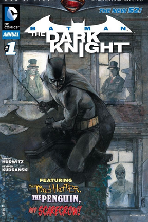
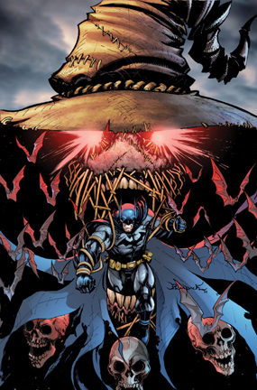
BatmanDarkKnight-AnnualNo1-cover1After a pretty undeniably rocky start, the New 52 title: Batman: The Dark Knight, gained creative traction amidst the rubble of what went before and made great strides towards becoming something truly worthwhile & to be looked forward to upon handing the reins to writer Gregg Hurwitz in issue 10 of TDK. From there he instantly restored my faith in this title launching “Cycle Of Violence” from TDK issues 10-15: a well written New 52 origin of classic Bat-Rogue, The Scarecrow. Hurwitz followed that with a disturbing and brutal reinvention of The Mad Hatter with incredible contribution from artist Ethan Van Sciver in issues 16-19.

This month’s Batman: The Dark Knight Annual #1 continues the sublime re-teaming of Hurwitz and artist Szymon Kudranski that began in this very same month’s The Dark Knight #20. Previously, the team crafted the truly exceptional, Penguin: Pain & Prejudice mini-series, a remarkably touching & tragic exploration of The Penguin’s origins & motivations in the New 52 DC Universe. In Penguin: Pain & Prejudice, Gregg Hurwitz penned a resonant & thoroughly engrossing character driven yarn, however, I found myself absolutely swept away by Szymon Kudranki’s mesmerizing renderings of what was once only mere words on paper. I thought to myself in December of 2011, “DC really NEEDS to get this Kudranski character on an ongoing Batman title…A.S.A.P.” And in June of 2013: here we are & we are very lucky to be here, indeed! Kudranski whisks us to a world rife with shadow, suggestion & grotesque detail.

The Dark Knight Annual #1 focuses on a mysterious & clandestine meeting between TDK’s most prominent villains, The Scarecrow, The Mad Hatter & The Penguin (whom I consider to be Szymon Kudranski’s signature DC character), inside an abandoned building on Halloween Night. Hurwitz & Kudranski are playing with their most familiar toys in this story – which just so happens to be an oversized, stand alone, expertly paced, perfect pitched suspense tale well worth your hard earned $4.99. A great story for new readers and rewarding for longtime and thorough followers, TDK Annual #1 is probably the best DC Annual I’ve encountered since the launch of the New 52. It has mood and atmosphere to spare and all at once evokes elements of classic Batman stories like the wholly charming Jeph Loeb & Tim Sale Halloween books & Grant Morrison & Dave McKean’s revered Arkham Asylum while taking all the right lessons from Batman: The Animated Series (such as how to use Batman the most efficiently to maximize impact on arrival without sacrificing the quality of the story) all through that moody, haunting Kudranski lense.

I’m giving Batman: The Dark Knight Annual #1 highest marks…This issue’s exceptional high quality far exceeds it’s slightly inflated price tag and is just a beautifully drawn and expertly told with unexpected laughs & thrills for new readers & significant rewards for the ever faithful.  A one and done story fit to stand the test of time. A New 52 classic.

*****

5 out of 5 Stars.

___________________________

Follow Raymond Jacques on Twitter:  @danceformyhorse

REVIEW: ‘Green Lantern’ #21

(DC Comics, 2013)

Review by Shawn Warner

WRIITEN BY:  Robert Venditti
PENCILS BY:  Billy Tan
INKED BY:  Richard Friend
COLOR ARTWORK BY:  Tony Avina & Alex Sinclair

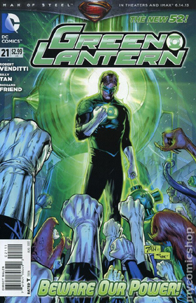
GreenLantern-No21-cover1It was so strange to see a new issue of Green Lantern without Geoff Johns’ name on the cover. For nine years the two names have been synonymous. Now Robert Venditti has some huge shoes to fill and he has started that task this week with issue 21. After reading this I had the distinct feeling that I had just read a first issue, not that the whole Green Lantern Universe has been turned upside down. It hasn’t. It’s just that after nine years this book had to be a very definitive jumping on spot, and it is. It is written very much like the Green Lantern film but better. Venditti does a fine job of giving Hal Jordon a personality, not quite the same one that Johns’ has built over nine years but the differences are subtle, so far.

The story covers a whole lot and is paced so briskly that it felt like I was finished reading it in a matter of seconds. It begins on Oa in the very near future with Hal leading a rag-tag unit of surviving Lanterns against an unseen enemy. Their rings are running low, roughly 20% charge remaining on each ring. The tattered band of Lanterns makes their way to the central battery only to find it dead.

In the present Hal and Carol Ferris are having a very deep conversation focusing on the state of their relationship. Carol is having some misgivings about her feelings for Hal and if they even in fact constitutes love at this point. Although she admits that she is happy to have him back following his ordeal she is unsure whether or not she is happy with him in the larger sense. Hal is smug and sure of himself bordering on arrogance as always. He handles the situation with a smirk and a convenient exit provided by his ring. This seems to suit Carol just fine as she expresses her need for some time apart from her space hopping ring slinging boyfriend.

Hal is called to Oa to the planetary citadel. Inside the evidence vault he meets up with Kyle Rayner. This scene has the feel of a James Bond film where Q demonstrates all the new gadgetry to a roguish disinterested Bond. There are strange weapons aplenty covering tables and walls, as the Guardians go about the work of filing these things away one of them rather nonchalantly informs Hal of his promotion to corps leader, effective immediately. The interaction between Kyle and Hal make this scene one of the lighter hearted of the book. Venditti nails the camaraderie those two share with some very fine dialogue. The voices of these characters are very believable and ultimately they are both likable guys. Venditti again shows his dialogue chops in the next scene between Hal and Kilowog who has taken over for resigned Lantern Salaak.

Kilowog is sitting alone processing the rings of the fallen which are being held inside a containment field. Hal makes his first command decision and releases the rings to find new recruits. Once loosed the rings fly off in search of worthy sentient beings to replenish the corps. Before Kilowog can finish voicing his disagreement with his new leaders decision Larfleeze and an army of constructs turn the Oa sky orange as they descend. Kilowog calls all Lanterns to battle but there are scarce few to answer his call. The Sciencells are even emptied to meet the need for combatant defenders. The ensuing battle is without a doubt one of the highlights of the issue. Billy Tan does an excellent job of rendering the action.

The final page shows the rings begin to return with reluctant wearers who have already made their desire to leave evident. They pull the rings from their fingers and plead to go home, not the start of his new corps Hal was hoping for to say the least.

All in all I think Venditti did an admirable job. The story was fast paced; the characters and dialogue are lively and complex. I really liked it and I am an unabashed Johns fan. As such I certainly had my reservations going into this but like a Blue Lantern I had hope. This book had to be received well I think more so than any other DC book this year. We know Batman is safe in the infinitely capable hands of Snyder and Capullo, Trinity War is a no brainer that it will perform and sell well but the fate of Green Lantern rests with Robert Venditti and Billy Tan. The tone is different but all the elements that make for great Green Lantern comic books are there. I think the “Dark Days Ahead” look very bright indeed.

Billy Tan is a seasoned veteran and I have been a fan of his work for some time now. So when it was announced that he would be doing the pencils I breathed a small sigh of relief, at least the book was going to look good, and it does. Tan does a fantastic job here turning in some of his best pages. His re-design of Oa looks less like a city from a fantasy novel and more like an expansive metropolis. His character designs are spot on from familiar facial features and expressions of the human characters to the more imaginative looks of the aliens, he nails them. Tan does an especially fine job on Larfleeze giving him the sinister look of a humanoid dragon.

This creative team has proven themselves up to the task but unfortunately for Venditti the inevitable comparisons to Geoff Johns have only just begun. He probably will never outrun the very long shadow that Johns’ stellar nine year run has cast over this character. This and the arduous chore of placing the other Green Lantern titles upon his shoulders merely by virtue of setting them up in this book make Robert Venditti’s  very enviable new assignment a blessing and a curse.  I look forward to what this team is going to bring us and I wish Robert Venditti and Billy Tan a very long and successful run.

This is a perfect jumping up spot for anyone who may have had the misfortune of missing Geoff Johns’ run on Green Lantern. As I said it reads very much like a first issue; lots of set up but no lull in the action. Fine artwork and solid writing earn this book an 8 from me but the sky’s the limit from here, great start. Until next week, see you at the comic book store.

___________________________

Follow Shawn Warner on Twitter:  @shawnwarner629

REVIEW: “Legends of the Dark Knight” #9

(DC Comics, 2013)

Review by Cory Thrall

Story One: “Dreaming He Is a Butterfly”
WRITTEN BY:  Christos Gage
ARTWORK BY:  Jheremy Raapack
COLOR ARTWORK BY:  Carrie Strachan

Story Two: “Tap Tap”
WRITTEN BY:  Ray Fawkes
ARTWORK BY:  Stephane Roux

LODKD-cover-print-09_cmyk_plov145quz_“Legends of the Dark Knight” is such a great idea - different creators from all across the comicsverse doing short Batman stories, released as a Digital First then printed in single issue collections.  Though the trend with these aims more towards a complete storyline, releasing chapters of a tale as opposed to a short comic every week, these first batches were mostly single stories.  This collection - #9 in the series - is of the multiple story variety, with two being printed in this issue.

One of the main problems I’ve had with this title, and this was covered in a review I did earlier of issue #6, is that the stories are usually hit or miss.  This issue, much like the one reviewed earlier, is mostly a ‘miss’ and for nearly the same reasons - the writing and originality of the stories.

The first story we have here is “Dreaming He Is a Butterfly”, which has some great artwork from Jheremy Raapack who, among other things, has been a major part of another of DC’s Digital Firsts - “Injustice”.  His work is weird, chunky, and very unique, and I feel he does a pretty good job of covering a lot of area, especially in “Injustice”, with so many characters in and out of the chapters.  He just gets a good hold on a character’s look and sticks with it throughout.  His Batman is the Bats we know and love, with a few hints of maybe some Kelley Jones or Sam Kieth in his lines and details.  Still, very much his own work, and it works.  The Scarecrow design leaves a bit to be desired, but other than that it’s a solid tale - but only visually.

Here we go with the writing again.  Christos Gage has brought us a story that is sadly very ‘played out’ in all forms of media including comics, television shows both classic and ‘modern’, etc.The tale revolves around Scarecrow having created another new version of his fear gas, but altered to not only be absorbed through the skin (something Batman is not prepared for in this) but also to cause a slightly different effect on the victim.  With some quick explanation, we learn the new gas is more oriented around the “the real enemy”, namely ourselves.  Combining your fears and dreams into a maelstrom of madness, this new gas takes Batman on a trip into his own head and into a false reality.  In this ‘alternate universe’ shown to Bruce by Scarecrow’s puffs of green craziness, Batman is no more, Bruce is beaten and busted up, and he is now bound to a wheelchair.  He has bouts of dementia where he believes he is still Batman fighting his war on the streets of Gotham, only to be awoken from this to what is now his ‘reality’.  Though this new form of fear gas is highly potent and fully realizes an entire ‘universe’ in a way much stronger than any we’ve seen before, Bruce starts to notice problems with this ‘new life’.  Add in an Alfred that seems to hate Bruce for wasting the life and money he had on such a frivolous pursuit, and the ground is placed for the rest of the story.  Sadly, from here the bulk of this story is filled with running over that same idea again and again with Alfred, and eventually Gordon, who both continue to tell Bruce that this is reality, and the life he had as Batman is no longer, now just an hallucination keeping him from fully living the life he has left.  Bruce eventually finds a way to see through the false life, and pops back in time to take Scarecrow out in the usual fashion.

Now, this whole thing might ring a few bells with some of you out there, and well it should.  This story has been told so many times over, from ‘the Twilight Zone’, random films throughout the years (like “Gothika”, for instance), and even an episode of ‘Buffy the Vampire Slayer.  There’s more examples, I’m sure, but that gives you a good range as to what I’m talking about.  The whole set-up is as much in those as it is in this story.  The fake reality forced on the main character.  The false reality attempting to convince said character that it is the only one, that the other is strictly fantasy.  And, finally, the false reality broken through in some way by the smarter lead.  I really don’t see why we need another telling of this same story with different characters, and the writing of what is here is not exactly a winner, either.  The dialogue seems forced, overly dramatic, and really doesn’t sell the story on it’s own merits.  It’s just Batman and crew molded into this tired device, and is not really handled all that well.  Disappointing, for sure.

The second story is much shorter, and is a quick Bats and Catwoman tale - written by the usually awesome Ray Fawkes - that reads more like an idea than a fully scripted comic.  Without going into the story (well, there really isn’t one, honestly), it’s a clunky bit of writing, and there never really seems to be anything important going on.  What serves as the story here is not much more than a situation, without much lead in and even less of a closing.  Again, like the opening story, I really can’t see why this was published.  This may come off as unreasonably harsh, but there is no other reason to read this story but one: the amazing artwork by Stephane Roux.  The art has an amazing look to it, and is smooth and almost noir-ish in presentation.  This Batman resembles the Michael Keaton version from the Burton films, with a bit of the more classic Batman, and I think it really looks great.  Giving it an almost painted look, with heavy shadows and thick lines, this is some quality work all the way through.  The color art creates an almost animated yet realistic style that really livens up the page and brings some awesome colors to what starts out as a very dark theme in the art.  It’s just lovely work that makes me wish there was some actual meat to this short comic.

And that’s the theme with these, it seems.  Almost every one of these I read has at least one story that is totally botched and it makes me a bit unhappy as a huge Batman nut.  The original “Legends…” print title from a while back had much stronger stories and issues, and DC really seemed to care more for that version of the title than this one.  In a way - and even with some great creators like Ray Fawkes - this feels like a garbage dump of old or new talent, needing work to keep them in the job or to get them farther up.  While there have been many of these chapters I have enjoyed, they’ve mostly been from the first batch or the most recent chunk.  This issue?  Even with the solid artwork for both stories I say avoid this issue.  And this is coming from someone who has been unbelievable obsessed with Batman comics for nearly 30 years.  I take this character and is world to heart, and when he’s handled badly, it really stands out.

I would really like to see more originality in these chapters, and have been very let down by this title as a whole.  For the sake of my love of Bats and the awesome artwork on display, I’m going to give “Legends of the Dark Knight” #9 a score of 2.5 out of 5.  It’s just not hitting the mark.  Actually, it’s not even that close to the target.

___________________________

Follow Cory Thrall on Twitter:  @FeralFang27

REVIEW: “Tales of a Checkered Man” Volume 1

(Self Published, 2013)

Review by Brad Gischia

WRITTEN / ARTWORK BY:  Denver Brubaker

TOACM AE vol1 graphicGreetings from the Wasteland!

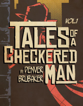
This week I chose a neat little collection called Tales of a Checkered Man Volume 1, by Chicago-based cartoonist Denver Brubaker.

The book is a compilation of Mr. Brubaker’s ongoing comic strip of the same name, in which our hero, The Checkered Man, fights the darker elements in Exotic City.  The first three chapters document, in three to six panel segments, the Checkered Man’s crippling fear of heights and the author’s love of the super hero/vigilante genre.

The sequential nature of the comic strip makes this an easy book to digest all at once or read in small increments, just like a newspaper strip, but Brubaker has stitched the narrative together well so that the story continues to move forward in those small segments.  There is bonus material at the end, a short comic about the back-story mentioned therein, and a group of early sketches of the characters.

Although I will always urge you to support independent artists, Denver Brubaker has made it easy for anyone to enjoy his work.  By visiting www.thecheckeredman.com, you can view over three years worth of strips.  You can follow the story of this often bumbling and reluctant hero as well as read the creator’s blog on the site.

The book is a mad, fun joining of Bill Watterson and Bruce Timm, with a little Frank Miller and H.P. Lovecraft thrown in for good measure.  Don’t forget to add a heaping helping of noir, and you have Tales of a Checkered Man.

___________________________

Follow Brad Gischia on Twitter:  @comicwasteland

REVIEW: “Captain America” #7

(Marvel Comics, 2013)

Review by Shawn Warner

WRITTEN BY:  Rick Remender
PENCILS BY:  John Romita Jr.
INKS BY:  Scott Hanna & Klaus Janson
COLOR ARTWORK BY:  Dean White

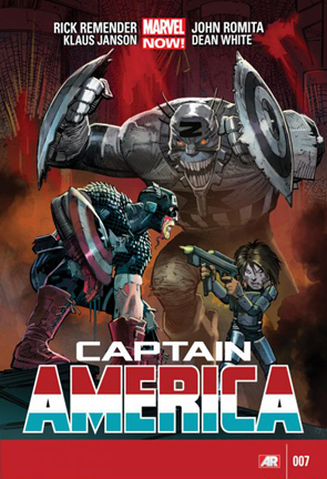
CaptainAmerica-No7--1There is light at the end of the tunnel but will Cap survive to reach it and if he does will he be in one piece, recent events in Zolandia would make this a tough call. Issue number seven begins with a flashback two years prior to the events currently taking place. Cap and his unofficially adopted son Ian are having a father/son conversation over dinner on a desolate hillside. Ian asks Cap if he misses his old life and Cap expounds on the relationship he had with his father and waxes philosophical on the meaning of true happiness. This is a poignant moment both sincere and serene in tone. However that idyllic calm is shattered on the very next page. We are brought up to the present which finds Steve Rogers a bit worse for wear, his hair is cropped and his costume is even more tattered and stitched together in more places. He is hacking his way through Arnim Zola’s lackeys, taking their heads off with his shield as he makes his way into Zola’s stronghold. He is in search of Ian who has been captured and set to be brainwashed before being brought under Zola’s wing.

Cap fights his way deeper into the inner sanctum before he is confronted by Zola’s warrior daughter, Jet Black. She brings to mind Big Barda in appearance complete with regal headgear and statuesque build. Black proves to be more than Cap’s equal in combat however, he is able to reach out to her and win her over to his cause, for the time being anyway. She takes Cap into her confidence revealing to him that they are not merely in a city but a battle station, one that is about to lift off and rain Hell down on Cap’s homeland. She goes on in great detail to describe how this assault is going to transpire and the damage that it is going to inflict. Zola plans to take control of thousands of high value targets including; super beings, world leaders and the affluent, infecting them with a potent liquid consciousness. The only option remaining is for Cap to get to Earth and warn of this coming attack. He believes that The Avengers still exist in some form and that they are his, and the Earth’s, only hope. Jet Black agrees to help him get back only if Cap will promise to give Ian a normal life. She tells him where Ian is being held but before Cap can get to him the Zola virus he is carrying flares up and renders him unable to walk. As if this isn’t bad enough a virtually paralyzed Cap is then shot in the chest by the last person he would expect of such a vile ruthless act. What an ending! This is truly my favorite issue of this series and I have loved them all thus far. Remender has created a world that feels like equal parts Jack Kirby and 40’s radio sci-fi serial. This is so shockingly different from what Ed Brubaker has given us that it has put some readers off. To those readers I would most emphatically state, read this! It is not the intrigue and espionage that Brubaker thrilled us with but it is solid and entertaining writing. Remender perhaps even more so than Brubaker gives us a Steve Rogers that never says die, a man who beyond all reason will not stay down but keeps fighting for the greater good whether that be the safety of the world or the love of a father for his son.

Remender’s characterization and imagery is enthralling. His world of Dimension Z and its inhabitants are the stuff of nightmares. Arnim Zola is as terrifying a villain as you are likely to find, part Darth Vader, and part Charles Manson. He has given John Romita Jr. some amazing images to work with and JR Jr does his usual brilliant job. Romita Jr is quite possibly my favorite artist of all time. I have been a fan of his work for such a long time. His epic run on Amazing Spider-Man is without equal but I think he may out do himself if he stays on this book (and I hope he does). I have heard some people criticize his work because of the exaggerated heads and  wide-eyed features of his characters but that is what make his work so great, his unique perspective and take on anatomy. The way he renders the action sequences is par excellence, the fights and violence here take on a poetic look and feel very much like a ballet, similar to the tone he used in Kick Ass.

Klaus Janson is a seasoned, meticulous inker. He has inked some of the greatest works of Frank Miller and does a fantastic job here inking over Romita’s awesome pencils. Dean White brings out the nuances and details with his amazing colors; Dimension Z truly comes to life when he has added his impeccable touch to the finished work. Visually this book is a slam dunk home run with some other sports metaphor thrown in (I don’t know many I always got picked last). Anyway just flip through this book and you will see what I mean.

Over all Captain America is a top notch comic book, although it is not the same Cap that Ed Brubaker wrote, it is still Steve Rogers and he is being written and drawn by two of the best in the business. Please don’t be afraid of Dimension Z this is good stuff, give it a chance. This book is consistently entertaining and always leaves you wanting the next issue so for those reasons and many more I would rate it a 4.75 out of 5, in other words damn near perfect.

So until next week, see you at the comic book store my friends.

___________________________

Follow Shawn Warner on Twitter:  @shawnwarner629

RearView Review: “Anathema” TPB

(Tiny Behemoth Press, 2012)

Review by Brad Gischia

WRITTEN BY:  Rachel Deering
ARTWORK BY:  Christopher Mooneyham & Wesley St. Claire
COLOR ARTWORK BY:  Fares Maese & Ian Herring
LETTERING BY:  Rachel Deering

anathema_vol__1_trade_cover_by_theironrachel-d618tcd

A Return to Classic Horror Story Telling.

Greetings from the Wasteland!
*Warning here there be Spoilers!

I came to this book through social media and the wonders of the comic book convention.  (I will not ever stop talking about the wonders of the Con, I don’t want to and you can’t make me.)  I was browsing the list of artists that were going to be at C2E2 when I saw the name Rachel Deering, and upon further digging found the name of the trade she had recently penned, Anathema.  I checked it out and made sure her booth was a stop on my stroll through artists’ alley.

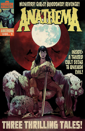
Anathema is the story of Mercy Barlowe, a woman born in a puritanical time filled with monsters and zealots. (You decide which is the more terrifying.)  The trade collects the first three issues in the series.

Deering’s story is thoughtful and provoking and at the same time has what I can only describe as a legendary feel.  It’s as if she has taken the greatest ideas from the vampire and werewolf tapestries and unraveled them, then woven them back together so they blend seamlessly.  There are aspects of the story that I really love, classic tropes like the evil nobleman Count Karnstein and the pure, if naïve, young woman named Sarah, doomed and lost to Mercy.  Classic…yes, but Deering’s take on these is unique and enjoyable to read.

Even if the story were mediocre, which it most certainly is not, the art alone would be reason to buy this book.  Christopher Mooneyham and Wesly St. Claire capture the feel of old horror comics and movies.  There are images of vampires that recall Max Schreck’s Count Orlock, as well as completely new takes on bloodsuckers and water beasts.  There is a Mignola-esque feel to some of the shadowing, but that does not detract from the art for me.  Deering has also created a whole new creature in the crow men, which the art brings to life in all of their soul-eating glory.

Rachel Deering has written a story that I’ve wished so many movies could have been.  The idea of pairing vampires and werewolves in a movie is as old as movies themselves, and never very enjoyable.  Even with the advent of CGI and the tremendous leaps in makeup technology, I’ve never really seen a film pairing that I could say worked well. (I’m sure there is at least one out there and that Twitter will supply the film for me.)

So pick up Anathema if you’re looking for a good horror book.  It’s a new take on a classic story, one that works with the common ideas of horror books and gives them enough of a twist to make them seem fresh.

___________________________

Follow Brad Gischia on Twitter:  @comicwasteland

REVIEW: “X-Men” #1 (2013)

(Marvel Comics, 2013)

Review by Cory Thrall

WRITTEN BY:  Brian Wood
PENCILS BY:  Olivier Coipel
INKS BY:  Mark Morales & Olivier Coipel
COLOR ARTWORK BY:  Laura Martin
LETTERING BY:  VC’s Joe Caramagna
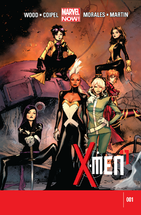
X-Men-NEW-2013--cover1This opening issue to Marvel’s newest X title - just “X-Men” this time around - is an interesting one, to say the least.  What you might normally expect from a first issue, and especially an X title, is a huge opener with a ton of weight and characters to toss around, with huge villains and even larger problems.  That’s perfectly fine and for the most part that has worked.  What Brian Wood and crew have brought to us with this “X-Men” #1 is a beast of its own breath, however, and though it’s a bit leaky, this first voyage is a strong and exciting one.

For this version of the team we have Storm, Rogue, Jubilee, Kitty Pryde, and Rachel Grey.  Now that *has* to be one of the greatest teams put together in some time, if you want the team to seamlessly co-exist, and the chemistry between the whole cast is very good evidence of this.  These are now classic characters that have known each other, been close friends, and usually team mates for a long time.  Decades, even.  That gives this team a bit of a different feel than most team books go as, even with their very individual character make ups and power levels, it still reads like you’re hanging out with your super-powered friends while they’re having a fun time through a simple but detailed adventure.  Add in an increasingly mysterious infant being backpacked around by Jubilee, and this title really gets the spunk going right away.

The issue opens on a bit of catch up in regards to John Sublime (AKA…um…”Sublime”), the man who is really a sentient “bacterial lifeform” and has a history of stirring up a ton of trouble in the X universe.  We’re told of his abandoned sister Arkea, who came crashing to Earth during it’s very beginning stages alongside her brother.  As the two came crashing down, they war against each other with Sublime coming out the victor, thus claiming Earth and casting Arkea out on her own to find a way to flourish in the growing cosmos.

We find Jubilee - an infant slung with her as she moves about - in an airport in Bulgaria, and as she boards her flight she gets emotional, telling us in monologue that her only real home is with the X-Men.  For a character that is famously disliked, this is a great piece of character building that was almost nonexistent in the years since her debut.  I admit, I was one of the “haters”, but that was more out of confusion and no real character to grab a hold of.  Like a lot still say, she just felt like a more modern Dazzler, and a bit of pandering to the slightly older audience they had begun to gather at the time of her first appearance.  I’m sure her lack of costume updates have been adding to that problem.  But this Jubilee is a different story altogether.  It may only be a few pages and a handful of lines, but what is here really gets you into what Jubilee is - a confused and scared young adult who is always in over her head, but always stronger for it.  That was a big surprise for me, and a welcome one.

As the issue moves on, Jubilee becomes convinced she is being followed, and alerts the Jean Grey School that there might be a problem.  Taking her refusal to explain what is going on as a bad sign, Storm, Rogue, and Kitty head to where Jubilee is currently (on a train heading for the school) to intervene.  What really shows you the attitude of this title is the moment Kitty phases into the train, finds Jubilee, and the first thing out of Kitty’s mouth is about the baby, and why Jubilee has one with her.  This is the level of friendship I spoke of before.  Were this just one of the more standard first issues of a team book this scene might have been used as business-as-usual - getting in and seeing what needs to be done, and quickly.  Instead, it’s more like a reunion of close pals, marveling over the changes that have occurred during their time apart.  It’s a very refreshing opening and while it does get down to the business at hand it’s a great scene and sets the tone for the whole issue.

Meanwhile, Sublime arrives via helicopter at the Jean Grey campus, and in an odd twist instantly turns himself in.  He explains that he needs to speak with them, and fast.  Back on the train, the rest of the crew are assembled and are questioning Jubilee about who might be following her and why, as well as inquiring about the origin of the infant.  Quickly explaining that she rescued him from an orphanage during a whole mess of danger, she tells them how she wants him to grow up around the X crew, like she did.  It’s a split second, but the moment is very touching and again digs a bit deeper into Jubilee’s mind and how she views her X family.  It really is an extension of herself, the only life she feels can really live.  Her wanting the infant to have that same experience shows her big heart, shining even for a baby she has no real ties to.  No one really pays too much attention, however, as the baby puts his fingers to a speaker on the train wall, and a light spark of electricity spits into it.  As the scene progresses, we see the electric surge run its course all the way through the cars, eventually making its way to the controls and slamming the breaks - tossing everyone around in a violent lunge forward as the train stops.  All this by the light touch of the small infant, giving us a sure sign as to what the attention of the team will be focusing on very soon.

The group scrambles to fix the situation and, when they do they move on to the school, where Sublime is being interrogated by Rachel Grey and Psylocke.  I’ve always loved Psylocke, and this scene is one of the reasons why.  She’s just such a badass you don’t even need to see her in action.  Sublime tells them of his sister Arkea, and warns them that she has come to Earth, seeking to infect and dominate the planet.  In another room, Jubilee is just getting settled in when her mysterious infant takes her cell and has his way with it.  This causes some things to go haywire and, when Sublime is told of the baby he reacts very strongly.  Before he can fully warn the X team, however, the true nature of what has been transpiring is revealed in a spooky and awesome final page.  Off to issue #2!

One of the things here that really stood out for me is Brain Wood’s writing.  I’ve been a huge fan of the Star Wars title he has been doing with Dark Horse, but I found all of his non-dialogue work in those to be more like script notes than an actual script.  Most of them are cold, robotic, and leave a lot to be desired in the storytelling department.  His work here, however, has much more of a ‘human’ touch to it, though it can still be a bit stiff in some parts.  I think it helps when he has characters to use in these situations, telling the story through their eyes and in their voice, as opposed to the ‘narration’ text in Star Wars.  It’s a huge benefit to his writing, and overall this issue reads very smoothly.  I’m excited by the way he took what could have been a set-up situation for a fill-in issue of some X book and made it such a strong and imaginative launch for the title.  While the set-up obviously put the story in motion, as it should, this particular adventure could have been a straight bomb if it were to be told by a less talented writer.  Woods takes the basics of such a scene, blows expectations apart and runs with it, which makes me very curious to see where he takes this story next.

Olivier Coipel and Mark Morales work here is beyond excellent and if that cover piques your interest I can assure you it’s just as awesome and energetic inside, as well.  The scenes are well set with strong backgrounds, believable surroundings, and perfect little details.  The action scenes are spot-on and flow with ease, even featuring some very creative poses, which is a rare thing in these books.  The look of the issue is a complete whole, with nothing seeming out of place or forced, and no lines wasted.  The artwork is a perfect fit to the mood, and handles the kinetic energy this title exudes with a zeal that sparks right off from the page.  It’s incredibly solid work, and is at times downright beautiful.  Definitely panels you want to look over again and again, picking up on the extra nuances and expressions.

So, the star of this title, or at least this issue?  Jubilee takes it, and in a landslide.  It’s not because she gets the most ‘screen time’ here, or that she is more or less the main focus, but because of the major growth given to her character in just a handful of pages.  I was curious to see how this title would round out and now that I’ve read it I am completely satisfied.  Naysayers be damned - Jubilee is my hero now!  No joke.  Get in on this title now, as it’s obvious this is going to be a blast!

___________________________

Follow Cory Thrall on Twitter:  @FeralFang27