(Self Published Web Comic) - Reviewed by Feral Fang & J.G. Butler
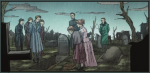
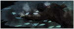
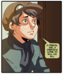
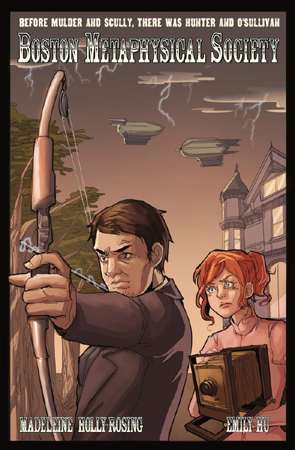 “Before Mulder And Scully, There Was Hunter And O’Sullivan”. That is the tag-line on what serves as the cover of this self published Web Comic, a tale about a trio known as the “Boston Metaphysical Society”. Set in a Steampunk universe, the comic follows the adventures of ex-Detective Samuel Hunter, aspiring Medium / Spirit Photographer Caitlin O’Sullivan, and genius scientist Granville Woods as they deal with spirits, demons, ghosts, and more. Another major player is the group B.E.T.H., a scientific gathering of minds featuring Alexander Graham Bell, Thomas Edison, Nikola Tesla, and Harry Houdini - using their last initials to form the organization name. To be honest, this was the first thing to bother me, as the use of historical figures seems almost forced, and isn’t really there for any specific reasons as per the people used. Without the name, B.E.T.H. could just have easily been a group of hyper-intelligent scientists, or something similar. For entirely different reasons, both the Boston Metaphysical Society and B.E.T.H. are on the hunt for a supernatural being known as “the Shifter”. Responsible for the death of Samuel Hunter’s wife, he and his BMS crew are after it to kill it. And, B.E.T.H.? Well, they want it for science, of course! As Hunter meets up with the famous members of B.E.T.H., he argues his case but quickly leaves in angry vengeance, annoyed by their want to capture the Shifter rather than kill it. Waiting for Hunter at the BMS office is a young boy who has a dire warning - a ‘demon’ was coming, and was headed their way to ‘kill us all’. This leads to a horrifying discovery for the trio - something or someone has killed five men, leaving nothing but a black, ashen pile in their place. And, as of today (2/19/2013), that is all that is up, as the comic is updated every Thursday. Overall, I really liked this comic, as it’s almost like if ‘Ghostbusters’ were to be played out in this universe.
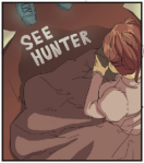
The mellow and deliberate pacing of the title and writer/creator Madeleine Holly-Rosing’s script are very nicely laid out and void of a lot of the pretentiousness that can be found in works of the same genre. Sometimes people take the ‘universe’ of Steampunk too far, making it more of the foreground itself than the characters and story. To them, it’s all about the look and style, not the meaty content that can be written into such an environment. “Boston Metaphysical Society” handles its world carefully and with grace. Almost everything ‘Steampunk’ about this comic is in the smaller details - some odd machinery in the background, for instance, or a bespectacled rodent that appears for all of two seconds. This story could have been told from any time period, and taken place in any location. It’s just a good, universal tale that even the most die-hard detractors of the genre would have problem finding fault with. Emily Hu’s artwork is very interesting, with an almost Manga style to some of the expressions, etc. Most of the work is clean and precise, but either the color art or the scanning/posting process tends to make some of the images seem like low resolution shots. The amazing color art by Fahriza Kamaputra and Gloria Caeli creates a look and mood that fits each scene perfectly. Creepy, darkened moments are all shades of blues, dark grey, and black, sometimes contrasted sharply by the use of ‘glowing’ nets, supernatural happenings, etc. Couple that with the amazingly ‘bright’ color art needed and provided in other scenes, and the range of Kamaputra and Caeli’s color palette is strongly evident. Troy Peteri’s lettering, which has previously been seen in such comics as ‘Amazing Spider-Man’, ‘Iron Man’, and supposedly a large percentage of Top Cow Production’s output, is clean and coherent, especially the sound effects. One thing that struck me as odd, however, was the use of a dark yellow background for the speech balloons. This made some of the conversations hard to read, and at times gave me a little bit of an eye strain.
The only major problem I had with my experience with this web comic is its presentation on the site. Each page of the comic is a single image on a web page, with each comic page placed on its own individual web page. The actual comic seems a bit too small for my tastes, and that is made worse by a web design that I fear would scare more people away than draw in. It’s clunky, not very ‘user friendly’, and resembles websites from the mid-to-late 90′s. The color scheme of the site (tans and browns) detracts greatly from being immersed in the comic as dark, spooky images are bordered by the sites light colors. Even when it does work in a way, as in some of the more lighter ‘dramatic’ scenes, it’s still distracting. All told, the web site can really make the comic itself feel separate, as if you’re just viewing an image on someone’s site, as opposed to reading a comic. The navigation of the comic is hindered by a messy design, as well, with the usual “Next Page” type links all lined at the top of each page. This wouldn’t be a problem, were it not for the fact that upon finishing each page of the title, you have to scroll back up to the beginning of the page to hit the needed link [EDIT: There is a 'Next Page' link near the bottom of the web page itself]. This is another thing that tends to bring you out of the comic’s world, and at times fully out of the ‘mood’ of the series. Even with the web site difficulties, this is still a damn fine comic that deserves your attention. All the right things are at work within it, from the writing and art, to the coloring and letters, this is the full package. I will definitely be back to continue following the story (it was left at quite a ‘cliff hanger’!) and checking to see these collected artists and characters grow not only within the book, but in the creators personal work, as well. This comic has great things ahead of it.
You can purchase a print edition of Chapter One in a soft-bound, hard spine book, complete with a nice laminated cover. Inside you will find early sketches, script pages, and even an excerpt from the short story “The Devil Within”. You can also grab an 11″ x 17″ poster of the cover artwork (without the logo), which can be signed by writer / creator Madeleine Holly-Rosing per request.
VIEW SOME IMAGES FROM ‘Boston Metaphysical Society” HERE:
___________
You can find the “Boston Metaphysical Society” Web Comic here:
http://bostonmetaphysicalsociety.com/index.html
___________
WRITING: 8 / 10
ARTWORK: 7.5 / 10
COLOR ARTWORK: 8.5 / 10
OVERALL EXPERIENCE: 8 / 10
___________________________