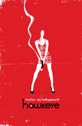
(Marvel Comics, 2013) - Reviewed by Sam LeBas
 Hawkeye #8 starts with a visual bang of brilliant storytelling from Aja and Fraction. This issue marks the beginning of a new story arc centering on Clint Barton’s seemingly ill-advised involvement with a red-headed stranger, Penny, and her litany of complications. From the beginning of this series, Fraction and Aja have stressed that their focus is purely on what happens to Clint when he is not working with the Avengers. That’s for the best, because issue 8 takes him to some decidedly un-heroic (a strip club mafia-front and jail come to mind).
Clint gets tangled up in Penny’s charms and proceeds to make a series of questionable decisions. Fraction bravely allows Clint to be a guy, not a perfect, shining, armor-clad hero. Clint’s ability to (and at times downright insistence that he must) make bad decisions make him intensely relatable and endearing. The humorous tone of the book remains grounded firmly in Clint’s refusal to take himself seriously. Against all odds, Fraction is able to make an elderly man wearing a tracksuit and an oxygen mask work as a villain in a Marvel superhero book; this should give you some insight into the outrageous twists and turns you can expect in this series. Near the end of the issue Fraction relates these street level skirmishes to some truly heavy-hitting monuments of Marvel mythology, showcasing his skill as a writer, and setting the table for the next course.
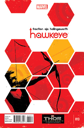
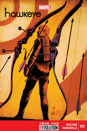
While Fraction’s choices make the narrative of this book stand out, what cements this book’s must-read status for me is Aja’s artwork. Nowhere in the cape-wearing comic world is there a more identifiable trademark style than an Aja on Hawkeye. Not only his rendering style, but his aesthetic choices regarding everything from layout to the angles he chooses to show scenes might as well have his name in neon lights.
For those of you that are unfamiliar with Aja’s art style its somewhere between pop art and 1960s advertising graphics. Aja uses very little shading, and coloring is generally very monochromatic. Because he commonly fills a page with up to twenty-four panels, his canvases can be very small. So, considering that Aja works with a limited: color palette, linear variation, and space; and still manages to tell such incredible visual stories, I am going to go ahead and label him a genius. I am so glad that he’s back for this issue.
In addition to getting Aja back on the title this month, we have also been given the extraordinary gift of five big beautiful full-page illustrations from Annie Wu. Wu’s work evokes a completely different feeling than Aja’s and provides brilliant contrast by hearkening back to the genre of romance comics. I do not think there is another medium on the planet that allows you to purchase so much great art for $2.99.
Hawkeye is a completely original take on hero books tethered by Fraction’s bold storytelling and Aja’s signature artwork that hits the mark in a big way this month.
___________________________
Follow Sam on twitter @comicsonice or check out her blog comicsonice.com

