(Lion Forge/IDW 2015)
Writer - Joe Casey
Artist - Jim Mahfood
Colorists - Justin Stewart and Steven Chunn
First off, I was only given a 7-page preview of this issue, so this review can only speak to what I’ve seen. Secondly, I haven’t seen an episode of Miami Vice since it first aired, and really only have those dim memories to rely on for what that show was like. I knew going into this that this book was not supposed to really be anything like the show, it’s taking a whole fresh approach to the concept. This is evident in even just the 7 pages I had to check out here. I’ll save the best for last and address the writing first.
I’ve read some Joe Casey in my time, and I consider him a good writer, competent and with some apparent chops. He is a solid mainstream writer that has a following, respect, etcetera. I personally don’t typically seek him out, and that’s not a dig on his work, I just find that my taste doesn’t often overlap with the projects I see his name attached to. Miami Vice: Remix is a rare exception. I almost added this book to my pull list just based on hearing about it and seeing some preview art months ago. I haven’t yet committed to that, so this really is the only chunk I have read of this series. I like it so far, and suspect that I would like reading a full issue, or even following it for as long as they keep it up. I think this concept is bold, and worth a look just based on the originality. I feel funny praising a book for originality, when it’s an adaptation (of sorts) of a TV series from the 80’s. In this era, that passes close enough to originality that given the fresh take they are presenting here, it seems like a “new†thing.
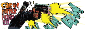
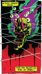
 Anyway, hard to give too much away since I only got a glimpse of it, but I see based on a ninja fight scene and a massive shootout, that this book has a pretty violent, action packed tone to it. I’m cool with that, and given the nature of the art (we’ll get to that) it’s probably pretty entertaining to follow along with said violence. There also seems to be a hint of supernatural, which is a departure from the show. I guess I can only say from this limited sampling that it has definite promise, and based on Casey’s rep, he should deliver the goods.
 The art. Oh man, not sure how to handle this. It’s definitely the draw here. It’s very engaging and fun to look at. When I think of Mahfood, I already think of the 90’s (sorry, that might not be fair, but that’s when I encountered most if not all of the work I’ve seen of his). I have always liked his stuff a lot, and consider him to be pretty talented. Also very recognizable. The art on display here doesn’t look like Mahfood art that I have seen before. It’s really something different.
How can I explain this? I feel like it’s a new direction for Mahfood, so in that sense it seems new and progressive. In another sense, I feel like I can detect a lot of different influences here. Maybe it’s just my opinion, but I am seeing Frank Miller, Bill Sienkiewicz, some early Ashley Wood, Gabriel Ba and Fabio Moon. Even to a lesser extent, Kyle Hotz, Kelley Jones, a little D’israeli and Paul Pope? Kyle Baker? I feel like there are hints of all these artists in there, all of which I like a lot by the way, but it’s hard to pin down. So in that way it feels fresh, because at the same time that it evokes these other artists, it’s not a direct copy of any of them. I don’t think Mahfood could be accused of aping anyone. Instead, it’s like he took all those artists that I like, threw them in a blender, put it on “liquefy†and then splattered the contents across these pages. It’s great art, and I like it a lot, it’s just got that weird thing going for it where it feels connected to so many other kinds of art.
 And that’s the thing, maybe it’s just me, but those artists all kind of scream “90’s†to me, and since Mahfood does too, I feel in a weird way like this art is either stuck in the 90’s, or is a throwback. Intentional? Not for me to say. It’s a remix of an 80’s show, so maybe they went with a deliberate 90’s approach to the art. Maybe I am just biased because of my age and when I first approached comics. Not sure. It’s really visceral and raw art. Mahfood is a talented guy for sure.
The lettering is also handled by Mahfood, and is seamlessly integrated in the art, so that is a nice touch. There is no separation of lettering and drawing. Sometimes, in other books, the lettering seems to float above the art on a whole other level. This is not the case here. It has a more indie, more graphic hand drawn style to it that works nicely. The action is… frenetic I guess is the best word for it.
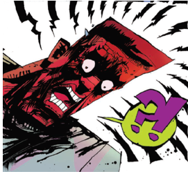
The coloring is a whole other thing to cover here. It’s well done, and very striking. It’s not representative of reality, in that it’s kind of subjective and impressionistic. It’s about as wild as the art. There are two colorists listed, so I really don’t know how the chores break down, but to me it seems like it oscillates from pretty flat and dark to wild and off the wall. I think that given the nature of the art, with its bold use of blacks, the color is pretty essential. If this was a black and white book, it might become too hard to read.
This is an interesting looking book. I was intrigued back when I first heard of it, and after having an appetizer-sized sampling of it I am even more intrigued. Everything about this book looks like a wild ride. From the violent over the top action to the bold and spastic art to the day-glo color scheme. I like what I’m seeing, and I think you will too. Give it a try. I know I will.
 BJ DuVall is a novice comic creator, and nerd. He likes to spout opinions, whether people like to listen or not. Usually not.
