(IDW-2015)
Writers- David and Scott Tipton
Artist- Ron Joseph
Letterer- Deron Bennett
Colorist- Jordi Escuin
Editor- David Hedgecock
Since I was a kid I’ve been a fan of Sherlock Holmes.  I saw Spielberg’s 1985 film ‘Young Sherlock Holmes’ and I was hooked.  As I got older and was introduced to the short stories, I developed a deeper appreciation for the character.
So when I saw that IDW was putting out a Sherlock Holmes comic I was ecstatic.  Then I started to worry.  Is it going to be done right?  What take are they going to go with?  Why is someone interested in playing with something as sacred as Sherlock Holmes?  Seemed to me like something that wasn’t worth the gamble not getting right.
Sherlock Holmes is a property that has always been revered and well done.  Historically, when it comes to the adventures of Holmes and Dr. Watson there are no schlubs aloud.  From Sir Arthur Conan Doyle’s creation of the character in 1887 with the massively popular short stories and novels, to the recent incarnations with Robert Downey Jr. and Benedict Cumberbatch, the bar has been set high time and again.   There is such an abundance of quality associated with the property that when you come, as they say, you need to come correct.  So when someone creeps onto the stoop of 221b Baker Street and rings the bell to ask, “May I have an audience with Mr. Holmes?â€, eyebrows will be raised.
Writer’s David and Scott Tipton rang that bell and where given the task of adapting yet another strong hold in the Sherlock Holmes staple of greatness;  Nicholas Meyer’s The Seven-Per-Cent Solution.
Originally a novel by Meyers in 1974, The Seven-Per-Cent Solution, was on The New York Times Best Seller list for 40 weeks and within just a few years was adapted into a movie in 1976. Â The movie was nominated for 2 academy awards including Best Costume Design and, more relevant to our discussion today, Best Adapted Screenplay, by Nicholas Meyers.
So now that the Tipton brothers are taking on the task of adapting this great work into a comic book they have a rather large shadow looming over head. Â The shadow may or may not be smoking a pipe.
 So let’s get to the book.  Issue one starts out in the year, 1939.   Dr. James Watson is recounting to a reporter the “true account†of Sherlock Holmes’ final encounter with his arch-nemesis, James Moriarty.
We then flashback to the year, 1881 and discover that Holmes has spiraled into a deep paranoia and delusional state.  Watson can only assume that this has grown out of his worsening addiction to cocaine.  This thrusts Watson and his concerned wife into the role of getting Holmes the help he needs, even if Holmes himself doesn’t want it.
This is the most interesting thing about this first book. Â Holmes versus Watson, in what Holmes is best at…mind games. Â The self proclaimed Holmes/Freud joint adventure is what got me to read this issue, but the cocaine addiction and the loose strands of fabric it leaves, story wise, to be pulled, is what makes this issue compelling.
The Holmes/Moriarty rivalry is also something that gets flipped on its head, but it is too early in the series to delve into what is actually happening with that.
The story is somewhat dialogue heavy, but that works for a book that is only as good as the characters it develops. Â Understanding this, I was concerned if they could stay true to the classic Sherlock Holmes vibe or if they would go another direction. Â To my delight they kept it old school and went for the high minded flowery talk. Â What I was beyond delighted about was that David and Scott Tipton not only made the dialogue passable, they completely killed it. Â I was blown away by the immersive nature that the spot on dialogue created for me while reading this. Â The world they created with just the dialogue alone was enough, but it ended up being a solid effort all around.
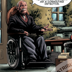
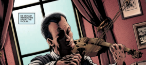
 The artwork by Ron Joseph and coloring by Jordi Escuin compliment the tone of the story extremely well.  The earth tones give the panels a richness that feels like you’re looking at an oil painting.  This gives the book a classic gothic feel, but uses just the right amount of pop to not be dull.  The art is at its best when images are drawn with a slight haze to them and only a few parts of the same object or person is drawn with detailed precision.  This mishmash gives off a warm and whimsical feeling that balances the darker story.
The lack of Sigmund Freud was disappointing, but I blame that on the burden that all first issues have in building a universe and jump starting a plot from scratch. Â The ending, although introducing an intriguing but sparsely used secondary character, fell flat for me. Â I think there were a few more interesting ways to go with the reveal, but this is just nitpicking a sound from all directions first issue.
Overall, this first issue of seven is a well constructed piece of work.  The story is tight.  The dialogue and art wrap you up in the world of a classic Sherlock Holmes adventure.  There isn’t much more you can ask for.  The expectations were high and it delivered.
The shadow of the beast that is, Sherlock Holmes, loomed heavily over the Tipton boys and company, but they did not run.  They stood tall and looked up at the monster and screamed, “Bring it on!â€.  I’m glad they did.
 Jonathan Winchester is a writer from Dallas, TX where he lives with his wife Maddie and their annoying cat. He believes Han was the lone shooter, that nothing looks better than a silver age comic in Mylar, and that there is no better feeling than walking into a dimly lit movie theater.
Twitter- @TexasWingnut
