 We got to ask writer Kevin Rau some questions about his awesome Superhero eBook series “H.E.R.O.”. There are many things I could say about how amazing this project is, but why don’t we hear it right from Kevin himself:
“H.E.R.O. is an ongoing series of novels (including a few short stories, and an illustrated guide). They are chronological in order, commonly beginning immediately after the last novel, so at this point, 12 books cover about 3 weeks in time in my world. Each book has its own plot lines, but also continue some plots that extend across numerous novels. Think of them like a television series, where each week something gets wrapped up, but other plots are merely advanced a little.
At this time, I’ve got the first full novel (123,000 words long) free on just about all major e-retailers, such as Amazon, Barnes & Noble, iTunes, Kobo, Smashwords, etc. (If you are wondering why it’s free, I’ve got 12 works out. I initially made it free for a kids program overseas, and realized that I might as well make it free for everyone to try out my work. My style of writing is slightly different, using a shifting first-person perspective, and it may seem odd to some people. However, it can help “get into the head” of various characters more than traditional writing, I think. Try it out and see if it’s for you. If it is, there’s a long series to enjoy. If not, then I hope the reader enjoys that novel and that they find something more to their liking.)”
We were able to get Kevin to do the favor of answering some questions for us, so lets get to the interview!
- We’d like to hear a bit about yourself, personally. How do you keep your days busy when not working on H.E.R.O. related work?
I work a full-time job as a Manager of Information Technology, so I stay pretty busy. Then, I go home, and work a full-time job writing, designing characters and covers, and handle promotion. (My kryptonite…) I do fit in some TV and getting together with friends, or shall we say future minions for my evil plan to take over the world!
- What brought you to this idea?
I’ve been a huge superhero fan since I was a teen in the 80’s. I enjoy comics, but I burn through a comic book in about 15 minutes. For the price, that’s not good “entertainment return” for the cost. Part of me has wanted to do a more extensive superhero storyline for a long time. What really drove me to it was all the reading I did in 2008, and I got tired of all the novels ending after a book or three. I wanted more stories with the characters I had invested my time in, and that didn’t happen. I knew that if I really wanted ongoing stories, I’d have to do it myself.
- How do you think the eBook approach is different than comics, in ways other than the fact that your project is a book, of course. Are there things that might be easier or harder, coming from the book approach?
Well, I’m fairly certain that comic books require more teamwork between the writer, penciller, inker, and colorist. I’m assuming those are all the people involved, too! I do everything with my novels, from the writing to the covers, etc. I do offload copy editing and beta-reading, though. You just can’t properly edit your own work. From the novel side, there’s a lot more detail that becomes involved. Full conversations are made between characters, and time has to be taken to describe scenes and actions. That differs a lot from what a good artist can do with pictures. Both have their strengths, I think. I wouldn’t want comics to go away, in favor of just superhero novels, for example - both have their place. I think people can get into the head of a character better with a novel. Comics, specifically the pictures, have something special in begin able to make characters look cool (or sexy, etc.).
Some else that might be harder with the novel are the plotlines. A comic book typically has about 2,000 - 2,500 words. My average novel is about 105,000 words. That’s a lot of detail, and requires interleaving plot points that would take most comics a year or more to get through.
- Have you, or do you have plans on working on comics in the future?
I don’t have any plans to do it. I’ve been asked if I’ll make a H.E.R.O. comic, and while I could pose some of the 35-ish characters I’ve designed 3D graphics for, and then render them in scenes, my backgrounds would be horrid. I prefer to stick with full novels.
- Can you tell us a little about some of the main characters, and a bit about the first book?
The first book is a primer, and focuses on three of the main characters as they change and learn about their powers. Granted, they deal with a psychotic mutant during that time as well, but the gist of the story is focused on them. The first character is Lance, e.g. Spartan, a “brick” who gains nigh invulnerable skin, muscles that harden to become steel-like and capable of lifting about 50 tons, and who has super-jumping. That power includes the ability to absorb the shock of landing so as to not cause harm to things he is carrying. He also becomes much stronger when his adrenaline really kicks up, or when he is superheated (such as a building fire). He’s a boy scout, focused on being a true hero, and is a friendly, overall nice guy.
The second is Rael, e.g. Black Tiger, who becomes a mutant. These are a class of super who have physical mutations that are odd in some respect, but who aren’t bricks. In Rael’s case, his fingertips can change into 2″ long black talons that can cut through steel, his canine teeth can elongate and do the same, and he heals unbelievably fast. Later, he mutates further and can grow tentacles from his trapezius muscles on either side of his neck when desired. He’s on the strong side of mutants, lifting about 5 tons, and is very agile. He runs upwards of 60 mph at a full sprint.
The third is Stephanie, e.g. Psystar, who becomes a psychic (there’s more to it, but since that’s involved in a storyline that takes upwards of 10 books, I won’t ruin it). She is a high-end “receiver,” and “hears” all thoughts within about 30 feet, and sees a TV screen of each person’s vision who is within 15 feet. These can’t be turned off, so she can easily be overwhelmed by too many people being nearby (the screens don’t overlap, and cover her visual space). She also has flight (upwards of Mach 2 eventually), and pheromones that can force others to do her bidding within about 30 feet. Both of those are always on as well.
There’s a lot of time spent on the changes when they mutate into supers, as well as some general superhero type events they choose to become involved in. Last, they go after Shrinker, as she’s been kidnapping people, and is an anarchist.
- Any future plans for this or any other project you’d like to share?
I just finished my first fantasy novel, called Necromancer’s Ascent. It’s at the copy editor right now, and should be out in a week or so. That’s the first novel in a fantasy world that I hope to make a full series, much like H.E.R.O. While waiting for that, I’ve returned to H.E.R.O., and have begun the writing of the next novel in that series. I expect to continue putting out H.E.R.O. novels for quite some time to come, barring something odd occurring.
I design 3D images of most of the major characters - primarily for use on the covers of the novels, but I found that I couldn’t stop making them, and have a bunch of extras on my website and Facebook page. Each character has 12-16 “renders” of them in different poses on the two sites. My website also includes a basic bio of each character in addition to the images.
___________
‘H.E.R.O.’ ON THE WEB:
http://www.kevinrau.com
http://www.facebook.com/herobooks
___________
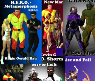
PHOTOS & IMAGES FROM “H.E.R.O.”:
-
-
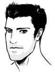
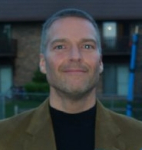
Author & H.E.R.O. creator Kevin Rau.
-
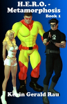
-
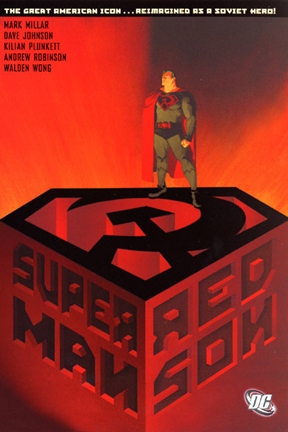
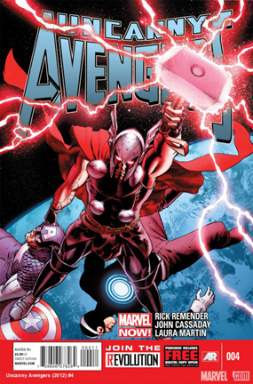
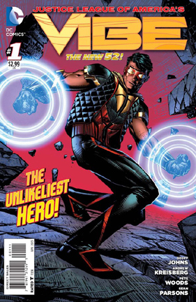
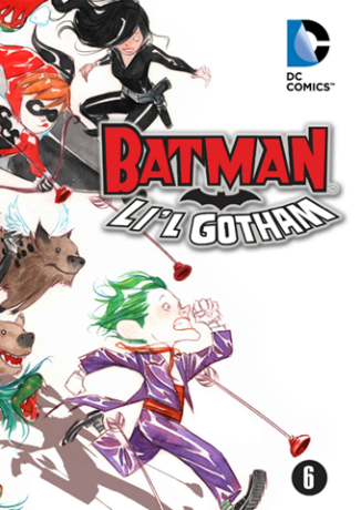
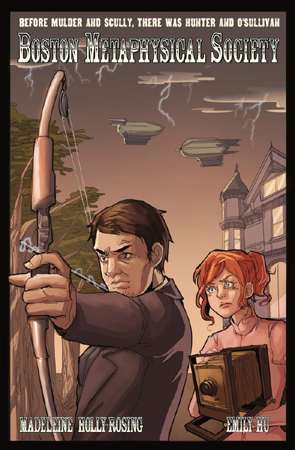
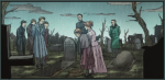
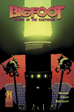
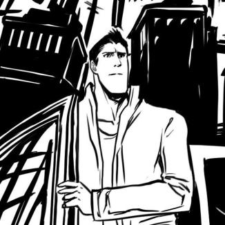
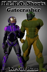
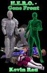
A cover from a book in the H.E.R.O. eBook series.
-
-
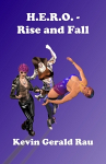
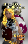
A cover from a book in the H.E.R.O. eBook series.
-
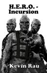
-
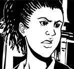
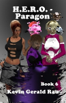
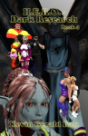
A cover from the eBook series.
-
-
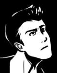
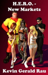
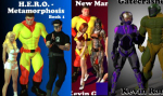
A book cover from the eBook series.
-
-
Cover from a book in the eBook series.
-
-
A cover from a novel in the H.E.R.O. eBook series.
-
-
A cover from the eBook series.
-
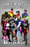
-
An illustrated guide to the H.E.R.O. eBook series.
-
-
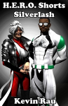
A cover from the eBook series, H.E.R.O.
-
-
Cover art from a novel in the H.E.R.O. eBook series.
-
-
Cover art from one of the novels in the H.E.R.O. eBook series.
-
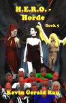
-
A cover from a book in the H.E.R.O. eBook series.
-
___________________________
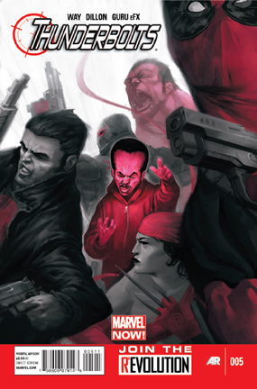 I’ve been really enjoying this title. Super silly, gory, and full of great over the top action! Even though I’m not totally familiar with all the characters they feel true and right where they should be. The intro thingy on the back of the cover talks about how they were brought together to take down evil they could never have reached on their own. Which they do, you just don’t care who it is - and neither do they. The king or whatever of somewhere is really mean to his people and has enough power to be a threat to some other country and more importantly has something powerful the big wigs want, blah blah blah. It doesn’t really matter with this title. Deadpool, Elektra, Punisher and Venom just like killing bad guys and we like to watch. Of course Gen. Ross has his own agenda that gradually unfolds, and members of the team begin to uncover super crazy stuff happen behind the scenes in what is already a horrible place to live. Throw in a “angel” and a love triangle and you’re ready for anything. Very gory without trying too hard.